
一、background-image不支持CSS3 transition
background-image不支持CSS3 transition,而CSS3 gradient渐变作为背景图片存在的时候,下面的CSS设置是不会有过渡效果的。
.gradient {
  background-image: linear-gradient(to right, olive, green);
  transition: background-image 0.5s linear;
}
.gradient:hover {
  background-image: linear-gradient(to right, green, purple);
}
鼠标hover会发现渐变的变化是很唐突的,一点过渡效果也没有。
下面问题来了,如果我们希望实现渐变hover时候有过渡变化的效果,该如何实现呢?我这里罗列的几种可行的方法。
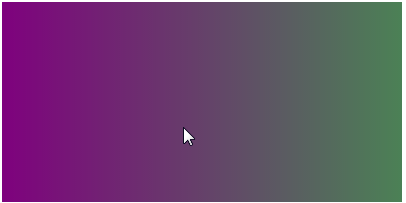
二、借助background-position实现渐变过渡
background-image虽然不支持CSS3 transition过渡,但是background-position支持啊,于是,通过控制背景位置,我们是可以实现渐变过渡效果的。
您可以狠狠地点击这里:借助background-position实现渐变过渡demo
实现效果如下(鼠标hover):
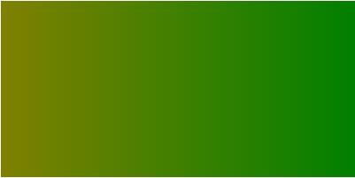
相关代码如下:
<div class="box"></div>
.box {
    max-width: 400px;
    height: 200px;
    background: linear-gradient(to right, olive, green, purple);
    background-size: 200%;
    transition: background-position .5s;
}
.box:hover {
    background-position: 100% 0;
}
三、借助background-color实现渐变过渡
background-image虽然不支持CSS3 transition过渡,但是background-color支持啊,于是,通过控制背景颜色,和一个颜色呈现技巧,我们也是可以实现渐变过渡效果的。
您可以狠狠地点击这里:background-color实现渐变hover过渡效果demo
鼠标hover前后效果对比:

相关代码如下:
<div class="box"></div>
.box {
    max-width: 400px;
    height: 200px;
    background: olive linear-gradient(to right, rgba(0,255,0,0), rgba(0,255,0,.5));
    transition: background-color .5s;
}
.box:hover {
    background-color: purple;
}
四、借助伪元素和opacity实现渐变过渡
借助伪元素创建变换后的渐变效果,通过改变覆盖的渐变的opacity透明度变化实现渐变过渡效果。
您可以狠狠地点击这里:CSS3 opacity实现渐变hover过渡效果demo
下图为hover之后的效果:

相关代码如下:
<div class="box"></div>
.box {
    max-width: 400px; height: 200px;
    background: linear-gradient(to right, olive, green);
    position: relative;
    z-index: 0;
}
.box::before {
    content: '';
    position: absolute;
    left: 0; top: 0; right: 0; bottom: 0;
    background: linear-gradient(to right, green, purple);
    opacity: 0;
    transition: opacity .5s;
    z-index: -1;
}
.box:hover::before {
    opacity: 1;
}
如需转载,请注明文章出处和来源网址:http://www.divcss5.com/jiqiao/j50127.shtml


