
CSS能够生成各种形状。正方形和矩形很容易,因为它们是 web 的自然形状。添加宽度和高度,就得到了所需的精确大小的矩形。添加边框半径,你就可以把这个形状变成圆形,足够多的边框半径,你就可以把这些矩形变成圆形和椭圆形。
我们还可以使用 CSS 伪元素中的 ::before 和 ::after,这为我们提供了向原始元素添加另外两个形状的可能性。通过巧妙地使用定位、转换和许多其他技巧,我们可以只用一个 HTML 元素在 CSS 中创建许多形状。
虽然我们现在大都使用字体图标或者svg图片,似乎使用 CSS 来做图标意义不是很大,但怎么实现这些图标用到的一些技巧及思路是很值得我们的学习。
1.正方形
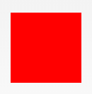
#square {
  width: 100px;
  height: 100px;
  background: red;
}
2.长方形
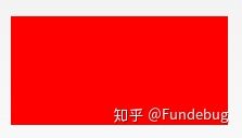
#rectangle {
  width: 200px;
  height: 100px;
  background: red;
}
3.圆形
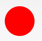
#circle {
  width: 100px;
  height: 100px;
  background: red;
  border-radius: 50%
}
4.椭圆形
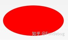
#oval {
  width: 200px;
  height: 100px;
  background: red;
  border-radius: 100px / 50px;
}
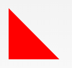
5.上三角
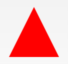
#triangle-up {
  width: 0;
  height: 0;
  border-left: 50px solid transparent;
  border-right: 50px solid transparent;
  border-bottom: 100px solid red;
}
6.下三角
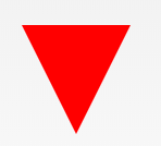
#triangle-down {
  width: 0;
  height: 0;
  border-left: 50px solid transparent;
  border-right: 50px solid transparent;
  border-top: 100px solid red;
}
7.左三角
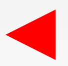
#triangle-left {
  width: 0;
  height: 0;
  border-top: 50px solid transparent;
  border-right: 100px solid red;
  border-bottom: 50px solid transparent;
}
8.右三角
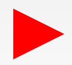
#triangle-right {
  width: 0;
  height: 0;
  border-top: 50px solid transparent;
  border-left: 100px solid red;
  border-bottom: 50px solid transparent;
}
9.左上角
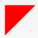
#triangle-topleft {
  width: 0;
  height: 0;
  border-top: 100px solid red;
  border-right: 100px solid transparent;
}
10.右上角
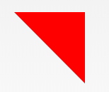
#triangle-topright {
  width: 0;
  height: 0;
  border-top: 100px solid red;
  border-left: 100px solid transparent;
}
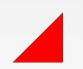
11.左下角
#triangle-bottomleft {
  width: 0;
  height: 0;
  border-bottom: 100px solid red;
  border-right: 100px solid transparent;
}
12.右下角
#triangle-bottomright {
  width: 0;
  height: 0;
  border-bottom: 100px solid red;
  border-left: 100px solid transparent;
}
13.箭头

#curvedarrow {
  position: relative;
  width: 0;
  height: 0;
  border-top: 9px solid transparent;
  border-right: 9px solid red;
  transform: rotate(10deg);
}
#curvedarrow:after {
  content: "";
  position: absolute;
  border: 0 solid transparent;
  border-top: 3px solid red;
  border-radius: 20px 0 0 0;
  top: -12px;
  left: -9px;
  width: 12px;
  height: 12px;
  transform: rotate(45deg);
}
14.梯形
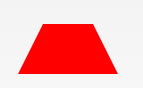
#trapezoid {
  border-bottom: 100px solid red;
  border-left: 25px solid transparent;
  border-right: 25px solid transparent;
  height: 0;
  width: 100px;
}
15.平行四边形
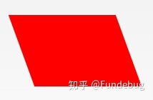
#parallelogram {
  width: 150px;
  height: 100px;
  transform: skew(20deg);
  background: red;
}
16.星星 (6角)
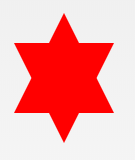
#star-six {
  width: 0;
  height: 0;
  border-left: 50px solid transparent;
  border-right: 50px solid transparent;
  border-bottom: 100px solid red;
  position: relative;
}
#star-six:after {
  width: 0;
  height: 0;
  border-left: 50px solid transparent;
  border-right: 50px solid transparent;
  border-top: 100px solid red;
  position: absolute;
  content: "";
  top: 30px;
  left: -50px;
}
17.星星 (5角)

#star-five {
  margin: 50px 0;
  position: relative;
  display: block;
  color: red;
  width: 0px;
  height: 0px;
  border-right: 100px solid transparent;
  border-bottom: 70px solid red;
  border-left: 100px solid transparent;
  transform: rotate(35deg);
}
#star-five:before {
  border-bottom: 80px solid red;
  border-left: 30px solid transparent;
  border-right: 30px solid transparent;
  position: absolute;
  height: 0;
  width: 0;
  top: -45px;
  left: -65px;
  display: block;
  content: '';
  transform: rotate(-35deg);
}
#star-five:after {
  position: absolute;
  display: block;
  color: red;
  top: 3px;
  left: -105px;
  width: 0px;
  height: 0px;
  border-right: 100px solid transparent;
  border-bottom: 70px solid red;
  border-left: 100px solid transparent;
  transform: rotate(-70deg);
  content: '';
}
18.五边形
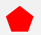
#pentagon {
  position: relative;
  width: 54px;
  box-sizing: content-box;
  border-width: 50px 18px 0;
  border-style: solid;
  border-color: red transparent;
}
#pentagon:before {
  content: "";
  position: absolute;
  height: 0;
  width: 0;
  top: -85px;
  left: -18px;
  border-width: 0 45px 35px;
  border-style: solid;
  border-color: transparent transparent red;
}
19.六边形
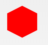
#hexagon {
  width: 100px;
  height: 55px;
  background: red;
  position: relative;
}
#hexagon:before {
  content: "";
  position: absolute;
  top: -25px;
  left: 0;
  width: 0;
  height: 0;
  border-left: 50px solid transparent;
  border-right: 50px solid transparent;
  border-bottom: 25px solid red;
}
#hexagon:after {
  content: "";
  position: absolute;
  bottom: -25px;
  left: 0;
  width: 0;
  height: 0;
  border-left: 50px solid transparent;
  border-right: 50px solid transparent;
  border-top: 25px solid red;
}
20.八边形
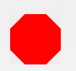
#octagon {
  width: 100px;
  height: 100px;
  background: red;
  position: relative;
}
#octagon:before {
  content: "";
  width: 100px;
  height: 0;
  position: absolute;
  top: 0;
  left: 0;
  border-bottom: 29px solid red;
  border-left: 29px solid #eee;
  border-right: 29px solid #eee;
}
#octagon:after {
  content: "";
  width: 100px;
  height: 0;
  position: absolute;
  bottom: 0;
  left: 0;
  border-top: 29px solid red;
  border-left: 29px solid #eee;
  border-right: 29px solid #eee;
}
21.爱心
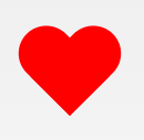
#heart {
  position: relative;
  width: 100px;
  height: 90px;
}
#heart:before,
#heart:after {
  position: absolute;
  content: "";
  left: 50px;
  top: 0;
  width: 50px;
  height: 80px;
  background: red;
  border-radius: 50px 50px 0 0;
  transform: rotate(-45deg);
  transform-origin: 0 100%;
}
#heart:after {
  left: 0;
  transform: rotate(45deg);
  transform-origin: 100% 100%;
}
22.无穷大
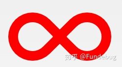
#infinity {
  position: relative;
  width: 212px;
  height: 100px;
  box-sizing: content-box;
}
#infinity:before,
#infinity:after {
  content: "";
  box-sizing: content-box;
  position: absolute;
  top: 0;
  left: 0;
  width: 60px;
  height: 60px;
  border: 20px solid red;
  border-radius: 50px 50px 0 50px;
  transform: rotate(-45deg);
}
#infinity:after {
  left: auto;
  right: 0;
  border-radius: 50px 50px 50px 0;
  transform: rotate(45deg);
}
23.菱形
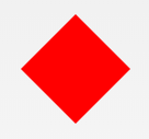
#diamond {
  width: 0;
  height: 0;
  border: 50px solid transparent;
  border-bottom-color: red;
  position: relative;
  top: -50px;
}
#diamond:after {
  content: '';
  position: absolute;
  left: -50px;
  top: 50px;
  width: 0;
  height: 0;
  border: 50px solid transparent;
  border-top-color: red;
}
代码部署后可能存在的BUG没法实时知道,事后为了解决这些BUG,花了大量的时间进行log 调试,这边顺便给大家推荐一个好用的BUG监控工具 Fundebug。
24.钻石1
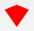
#diamond-shield {
  width: 0;
  height: 0;
  border: 50px solid transparent;
  border-bottom: 20px solid red;
  position: relative;
  top: -50px;
}
#diamond-shield:after {
  content: '';
  position: absolute;
  left: -50px;
  top: 20px;
  width: 0;
  height: 0;
  border: 50px solid transparent;
  border-top: 70px solid red;
}
25.钻石2
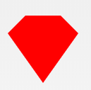
#cut-diamond {
  border-style: solid;
  border-color: transparent transparent red transparent;
  border-width: 0 25px 25px 25px;
  height: 0;
  width: 50px;
  box-sizing: content-box;
  position: relative;
  margin: 20px 0 50px 0;
}
#cut-diamond:after {
  content: "";
  position: absolute;
  top: 25px;
  left: -25px;
  width: 0;
  height: 0;
  border-style: solid;
  border-color: red transparent transparent transparent;
  border-width: 70px 50px 0 50px;
}
如需转载,请注明文章出处和来源网址:http://www.divcss5.com/jiqiao/j56179.shtml


