
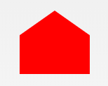
26.钻戒
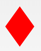
#diamond-narrow {
  width: 0;
  height: 0;
  border: 50px solid transparent;
  border-bottom: 70px solid red;
  position: relative;
  top: -50px;
}
#diamond-narrow:after {
  content: '';
  position: absolute;
  left: -50px;
  top: 70px;
  width: 0;
  height: 0;
  border: 50px solid transparent;
  border-top: 70px solid red;
}
27. 鸡蛋
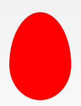
#egg {
  display: block;
  width: 126px;
  height: 180px;
  background-color: red;
  border-radius: 50% 50% 50% 50% / 60% 60% 40% 40%;
}
28.吃豆人
#pacman {
  width: 0px;
  height: 0px;
  border-right: 60px solid transparent;
  border-top: 60px solid red;
  border-left: 60px solid red;
  border-bottom: 60px solid red;
  border-top-left-radius: 60px;
  border-top-right-radius: 60px;
  border-bottom-left-radius: 60px;
  border-bottom-right-radius: 60px;
}
29.对话泡泡
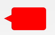
#talkbubble {
  width: 120px;
  height: 80px;
  background: red;
  position: relative;
  -moz-border-radius: 10px;
  -webkit-border-radius: 10px;
  border-radius: 10px;
}
#talkbubble:before {
  content: "";
  position: absolute;
  right: 100%;
  top: 26px;
  width: 0;
  height: 0;
  border-top: 13px solid transparent;
  border-right: 26px solid red;
  border-bottom: 13px solid transparent;
}
30. 12点 爆发
#burst-12 {
  background: red;
  width: 80px;
  height: 80px;
  position: relative;
  text-align: center;
}
#burst-12:before,
#burst-12:after {
  content: "";
  position: absolute;
  top: 0;
  left: 0;
  height: 80px;
  width: 80px;
  background: red;
}
#burst-12:before {
  transform: rotate(30deg);
}
#burst-12:after {
  transform: rotate(60deg);
}
31. 8点 爆发
#burst-8 {
  background: red;
  width: 80px;
  height: 80px;
  position: relative;
  text-align: center;
  transform: rotate(20deg);
}
#burst-8:before {
  content: "";
  position: absolute;
  top: 0;
  left: 0;
  height: 80px;
  width: 80px;
  background: red;
  transform: rotate(135deg);
}
32.太极
#yin-yang {
  width: 96px;
  box-sizing: content-box;
  height: 48px;
  background: #eee;
  border-color: red;
  border-style: solid;
  border-width: 2px 2px 50px 2px;
  border-radius: 100%;
  position: relative;
}
#yin-yang:before {
  content: "";
  position: absolute;
  top: 50%;
  left: 0;
  background: #eee;
  border: 18px solid red;
  border-radius: 100%;
  width: 12px;
  height: 12px;
  box-sizing: content-box;
}
#yin-yang:after {
  content: "";
  position: absolute;
  top: 50%;
  left: 50%;
  background: red;
  border: 18px solid #eee;
  border-radius: 100%;
  width: 12px;
  height: 12px;
  box-sizing: content-box;
}
33.徽章丝带

#badge-ribbon {
  position: relative;
  background: red;
  height: 100px;
  width: 100px;
  border-radius: 50px;
}
#badge-ribbon:before,
#badge-ribbon:after {
  content: '';
  position: absolute;
  border-bottom: 70px solid red;
  border-left: 40px solid transparent;
  border-right: 40px solid transparent;
  top: 70px;
  left: -10px;
  transform: rotate(-140deg);
}
#badge-ribbon:after {
  left: auto;
  right: -10px;
  transform: rotate(140deg);
}
34.太空入侵者(电脑游戏名)
#space-invader {
  box-shadow: 0 0 0 1em red,
  0 1em 0 1em red,
  -2.5em 1.5em 0 .5em red,
  2.5em 1.5em 0 .5em red,
  -3em -3em 0 0 red,
  3em -3em 0 0 red,
  -2em -2em 0 0 red,
  2em -2em 0 0 red,
  -3em -1em 0 0 red,
  -2em -1em 0 0 red,
  2em -1em 0 0 red,
  3em -1em 0 0 red,
  -4em 0 0 0 red,
  -3em 0 0 0 red,
  3em 0 0 0 red,
  4em 0 0 0 red,
  -5em 1em 0 0 red,
  -4em 1em 0 0 red,
  4em 1em 0 0 red,
  5em 1em 0 0 red,
  -5em 2em 0 0 red,
  5em 2em 0 0 red,
  -5em 3em 0 0 red,
  -3em 3em 0 0 red,
  3em 3em 0 0 red,
  5em 3em 0 0 red,
  -2em 4em 0 0 red,
  -1em 4em 0 0 red,
  1em 4em 0 0 red,
  2em 4em 0 0 red;
  background: red;
  width: 1em;
  height: 1em;
  overflow: hidden;
  margin: 50px 0 70px 65px;
}
35.电视
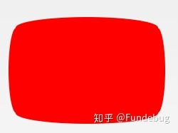
#tv {
  position: relative;
  width: 200px;
  height: 150px;
  margin: 20px 0;
  background: red;
  border-radius: 50% / 10%;
  color: white;
  text-align: center;
  text-indent: .1em;
}
#tv:before {
  content: '';
  position: absolute;
  top: 10%;
  bottom: 10%;
  right: -5%;
  left: -5%;
  background: inherit;
  border-radius: 5% / 50%;
}
36.雪佛龙
#chevron {
  position: relative;
  text-align: center;
  padding: 12px;
  margin-bottom: 6px;
  height: 60px;
  width: 200px;
}
#chevron:before {
  content: '';
  position: absolute;
  top: 0;
  left: 0;
  height: 100%;
  width: 51%;
  background: red;
  transform: skew(0deg, 6deg);
}
#chevron:after {
  content: '';
  position: absolute;
  top: 0;
  right: 0;
  height: 100%;
  width: 50%;
  background: red;
  transform: skew(0deg, -6deg);
}
37.放大镜

#magnifying-glass {
  font-size: 10em;
  display: inline-block;
  width: 0.4em;
  box-sizing: content-box;
  height: 0.4em
  border: 0.1em solid red;
  position: relative;
  border-radius: 0.35em;
}
#magnifying-glass:before {
  content: "";
  display: inline-block;
  position: absolute;
  right: -0.25em;
  bottom: -0.1em;
  border-width: 0;
  background: red;
  width: 0.35em;
  height: 0.08em;
  transform: rotate(45deg);
}
38.Facebook图标

#facebook-icon {
  background: red;
  text-indent: -999em;
  width: 100px;
  height: 110px;
  box-sizing: content-box;
  border-radius: 5px;
  position: relative;
  overflow: hidden;
  border: 15px solid red;
  border-bottom: 0;
}
#facebook-icon:before {
  content: "/20";
  position: absolute;
  background: red;
  width: 40px;
  height: 90px;
  bottom: -30px;
  right: -37px;
  border: 20px solid #eee;
  border-radius: 25px;
  box-sizing: content-box;
}
#facebook-icon:after {
  content: "/20";
  position: absolute;
  width: 55px;
  top: 50px;
  height: 20px;
  background: #eee;
  right: 5px;
  box-sizing: content-box;
}
39.月亮

#moon {
  width: 80px;
  height: 80px;
  border-radius: 50%;
  box-shadow: 15px 15px 0 0 red;
}
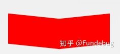
40.旗

#flag {
  width: 110px;
  height: 56px;
  box-sizing: content-box;
  padding-top: 15px;
  position: relative;
  background: red;
  color: white;
  font-size: 11px;
  letter-spacing: 0.2em;
  text-align: center;
  text-transform: uppercase;
}
#flag:after {
  content: "";
  position: absolute;
  left: 0;
  bottom: 0;
  width: 0;
  height: 0;
  border-bottom: 13px solid #eee;
  border-left: 55px solid transparent;
  border-right: 55px solid transparent;
}
41.圆锥
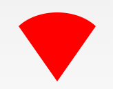
 #cone {
  width: 0;
  height: 0;
  border-left: 70px solid transparent;
  border-right: 70px solid transparent;
  border-top: 100px solid red;
  border-radius: 50%;
}
42.十字架
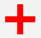
#cross {
  background: red;
  height: 100px;
  position: relative;
  width: 20px;
}
#cross:after {
  background: red;
  content: "";
  height: 20px;
  left: -40px;
  position: absolute;
  top: 40px;
  width: 100px;
}
43.根基
#base {
  background: red;
  display: inline-block;
  height: 55px;
  margin-left: 20px;
  margin-top: 55px;
  position: relative;
  width: 100px;
}
#base:before {
  border-bottom: 35px solid red;
  border-left: 50px solid transparent;
  border-right: 50px solid transparent;
  content: "";
  height: 0;
  left: 0;
  position: absolute;
  top: -35px;
  width: 0;
}
44.指示器

#pointer {
  width: 200px;
  height: 40px;
  position: relative;
  background: red;
}
#pointer:after {
  content: "";
  position: absolute;
  left: 0;
  bottom: 0;
  width: 0;
  height: 0;
  border-left: 20px solid white;
  border-top: 20px solid transparent;
  border-bottom: 20px solid transparent;
}
#pointer:before {
  content: "";
  position: absolute;
  right: -20px;
  bottom: 0;
  width: 0;
  height: 0;
  border-left: 20px solid red;
  border-top: 20px solid transparent;
  border-bottom: 20px solid transparent;
}
45.锁

#lock {
  font-size: 8px;
  position: relative;
  width: 18em;
  height: 13em;
  border-radius: 2em;
  top: 10em;
  box-sizing: border-box;
  border: 3.5em solid red;
  border-right-width: 7.5em;
  border-left-width: 7.5em;
  margin: 0 0 6rem 0;
}
#lock:before {
  content: "";
  box-sizing: border-box;
  position: absolute;
  border: 2.5em solid red;
  width: 14em;
  height: 12em;
  left: 50%;
  margin-left: -7em;
  top: -12em;
  border-top-left-radius: 7em;
  border-top-right-radius: 7em;
}
#lock:after {
  content: "";
  box-sizing: border-box;
  position: absolute;
  border: 1em solid red;
  width: 5em;
  height: 8em;
  border-radius: 2.5em;
  left: 50%;
  top: -1em;
  margin-left: -2.5em;
}
如需转载,请注明文章出处和来源网址:http://www.divcss5.com/jiqiao/j56180.shtml


